
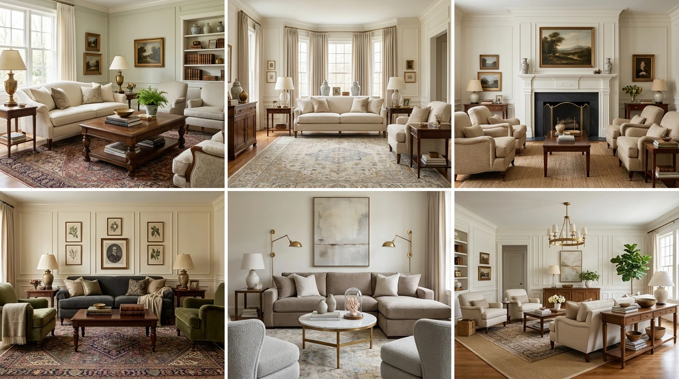
The Architect’s First Observation
The first thing I notice when I walk into an empty room is never the color of the walls – it’s what the room wants to become, and a well-proportioned space full of classic living room ideas is already telling you before you’ve hung a single picture. Ceiling height, window placement, the way afternoon light lands on the far wall – these are the facts of the room, and every decision that follows either respects them or fights them. This article moves the way I move through a house on a first walk-through: structure first, then light, then furniture, then surface, then the small finishing details the eye remembers without knowing why. We’re going to cover 28 specific ideas that build a traditional living room from the ground up, not a list of trends stacked on top of a room that was never read correctly in the first place. Along the way you’ll see the architectural detail living room decisions that separate a considered space from a merely furnished one – crown molding, hardwood floor pattern, the built-in that earns its place. Your room already has a logic to it. Your space is telling you what it needs; this walk-through is how you learn to listen. Follow the layers in order, and the classic living room decor choices at the end will feel inevitable rather than arbitrary. Let’s start where every good design starts – with the architecture itself.
The Spatial Matrix: How a Classic Living Room Is Built Layer by Layer
Before we walk the room, it helps to see the whole map. Classic living room ideas are never a single decision – they’re five architectural layers, each one setting the terms for the layer that follows, and understanding that sequence is what allows crown molding living room decisions and symmetrical furniture arrangement to work together instead of competing.
◐ LAYER 01: STRUCTURE AND ARCHITECTURE What it covers: The permanent bones of the room — molding, floor, fireplace, windows, built-ins. Why it comes first: Nothing placed in the room can correct a structural proportion that was never resolved. The most common mistake: Buying furniture before the architecture has been assessed or corrected.
◐ LAYER 02: LIGHT AND SHADOW What it covers: Natural light patterns and the layered electric lighting plan that supports them. Why it comes first: Light determines how every material and color in the room will actually read. The most common mistake: Relying on a single overhead fixture as the only source of light.
◐ LAYER 03: FURNITURE AND PROPORTION What it covers: Scale, arrangement, and the specific pieces that carry the traditional vocabulary. Why it comes first: Furniture proportion is dictated by the structural bones set in Layer 01. The most common mistake: Choosing furniture for style before confirming it fits the room’s scale.
◐ LAYER 04: SURFACE AND TEXTILE What it covers: Color palette, drapery, rugs, upholstery, and the textiles that soften the frame. Why it comes first: Fabric and color decisions only make sense once the furniture layout is fixed. The most common mistake: Choosing paint or fabric first, then building the room around it.
◐ LAYER 05: DETAIL AND FINISH What it covers: Hardware, vignettes, art placement, and the small choices the eye notices last. Why it comes first: Detail work is meaningless until the larger structure earns the attention. The most common mistake: Adding decorative detail to distract from an unresolved layout.
Every classic living room begins as an empty volume — a set of proportions, a ceiling height, a handful of windows facing a particular direction — long before it becomes a room anyone would call finished. An architect reads that volume the way a doctor reads an x-ray: crown molding tells her something about how the ceiling plane was meant to be perceived, the floor material tells her about light and durability, and the fireplace, if there is one, tells her where the room’s center of gravity already lives. In a classic living room, none of these elements are optional extras added after the fact – they are the argument the room is making before a single sofa arrives.
1. Crown Molding: The Architectural Detail That Changes How High a Room Feels Without Touching the Ceiling
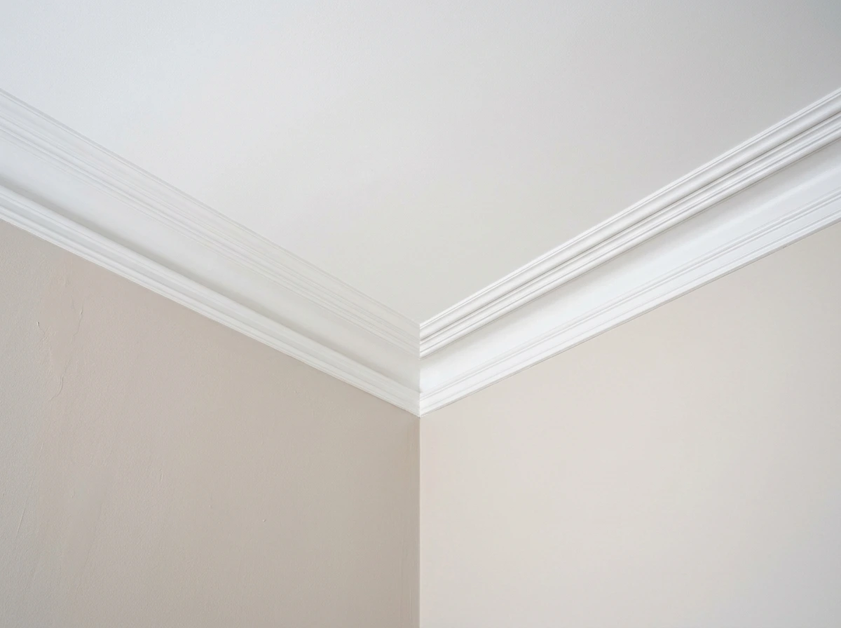
Crown molding does something no paint color can do — it defines the transition between wall and ceiling plane, and that single line changes how tall a room reads even when the actual ceiling height never moves. In a traditional living room ideas context, a molding profile between three and five inches tends to read as proportionate in rooms with eight- to nine-foot ceilings, while anything taller starts to compete with door and window casings. The most common failure is choosing a profile so slim it disappears from six feet away, which leaves the ceiling plane looking unfinished rather than deliberately simple. Crown molding living room decisions should always account for existing casing width, since mismatched proportions between molding and trim are what make a room feel assembled rather than built. Done well, this is the cheapest structural correction available to any American home, and it’s the first thing I specify before anything else in the room.
The Fireplace as the Room’s Structural Anchor Point
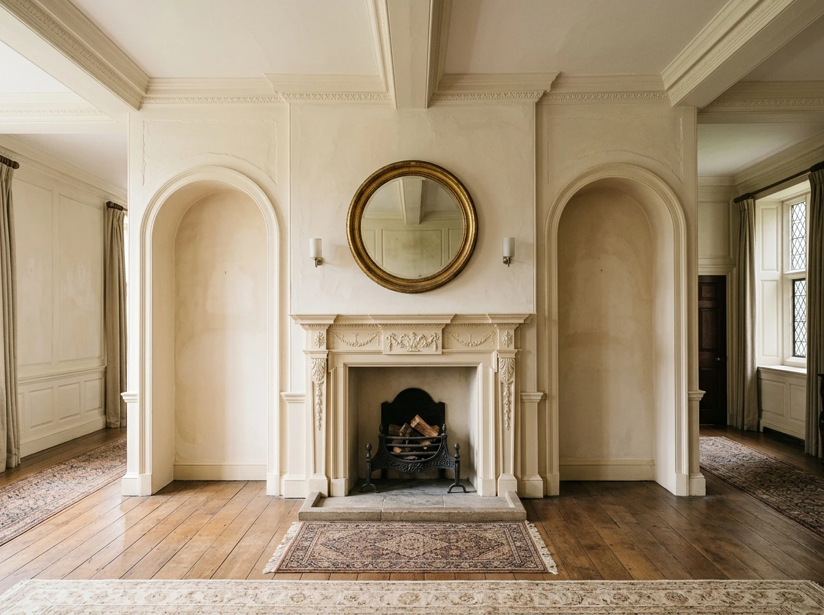
A fireplace does more architectural work than any other single element in a classic living room – it establishes a fixed point of symmetry that every furniture decision downstream will respond to. In New England sitting rooms and colonial revival living rooms alike, the mantel height typically sits between forty-eight and fifty-four inches, low enough to support artwork above it without crowding the ceiling line. The failure mode here is treating the fireplace as decoration rather than structure, arranging seating that ignores it entirely and leaves the room without a clear organizing axis. A classic sofa living room layout almost always faces the fireplace directly, with secondary seating arranged in relationship to that same axis rather than to the television. Respect the fireplace as the room’s anchor, and every other placement decision becomes noticeably easier to make.
Hardwood Floor Pattern Selection for a Classic Living Room Foundation
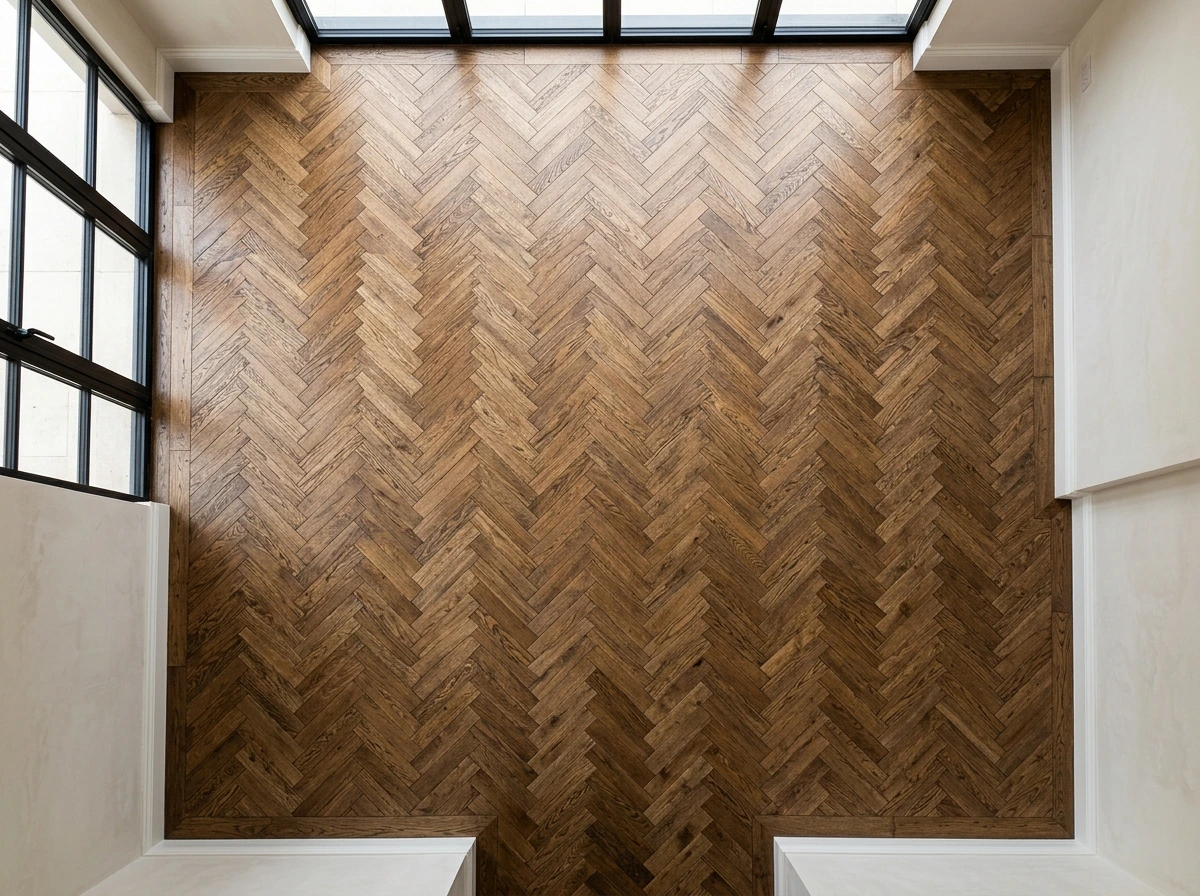
The floor is the largest continuous surface in the room, and its pattern sets a rhythm that everything above it either follows or contradicts. Herringbone wood floor patterns read as more formal and architectural than straight-plank installation, which is why they appear so often in colonial revival and mid-century American interiors with strong classical bones. The mistake most homeowners make is choosing a floor finish so dark it swallows natural light, or so glossy it competes with upholstery for visual attention. In a hardwood floor living room, a satin or matte finish in a medium tone tends to support both traditional and lighter California casual classic styling without dating the space. The floor should feel like a quiet foundation, not a competing pattern — get that balance right and the living room design decisions above it fall into place far more easily.
The Architect’s Specification: Floor Pattern Selection
- ⬡ Plank width between 3 and 5 inches reads as classic; wider planks skew rustic-contemporary
- ⬡ Satin finish over high-gloss for a traditional living room decor foundation
- ⬡ Run boards parallel to the longest wall to maximize apparent room length
- ⬡ Avoid gray-toned stains in rooms with warm crown molding or trim work
Wainscoting and Wall Paneling in a Traditional Living Room Context
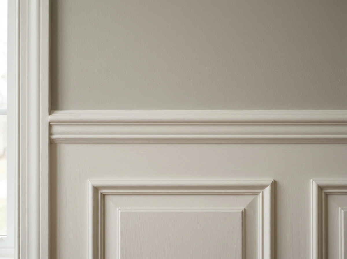
Wainscoting introduces a second architectural datum line to the room, splitting the wall into a lower structural zone and an upper decorative zone that can hold color or wallpaper without overwhelming the space. In a traditional living room decor, chair-rail height typically falls between thirty-two and thirty-six inches, aligning with the back of most upholstered furniture so the two elements read as a single coordinated system. The common error is installing paneling at a height disconnected from the furniture that will eventually sit against it, which creates a visual seam in the wrong place. Wainscoting living room wall treatments work best in rooms with at least nine-foot ceilings, where the extra millwork doesn’t compress the vertical proportion. This is architecture doing quiet, permanent work — the kind that still reads as intentional decades after it’s installed.
Window Proportion and Placement in a Classic American Living Room
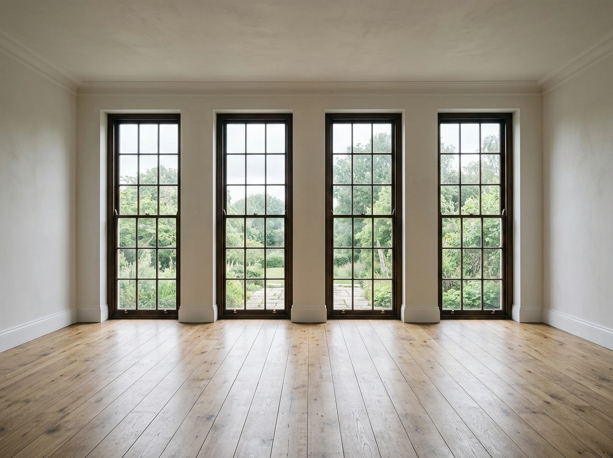
Windows in a classic American living room are rarely accidents of the original floor plan – in craftsman bungalows and colonial revival homes alike, they were placed to create symmetry on the primary wall long before anyone thought about furniture. The architectural principle is simple: windows set the location of natural light, and natural light sets which wall in the room will always read as the brightest. The mistake is fighting that symmetry by hanging a television or bookcase off-center on a wall the windows were designed to balance. In a classic living room, curtain hardware should extend at least four to six inches beyond the window frame on each side, so the glass – not the drapery hardware – reads as the room’s true proportion. Once you understand what the windows were built to do, the rest of the wall composition stops feeling like guesswork.
The Built-In Bookcase: When Architecture Becomes Furniture
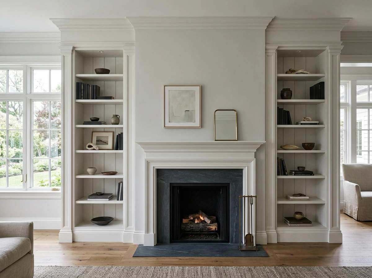
A built-in bookcase living room feature occupies a strange and useful middle ground – it behaves like architecture because it’s fixed to the wall, but it functions like furniture because it holds objects a homeowner chooses and changes. Flanking a fireplace with matching bookcases is one of the most reliable symmetrical furniture arrangement moves available in a classic interior, since it reinforces the fireplace as the room’s central axis rather than competing with it. The failure here is scale — a bookcase built too shallow or too short for the wall reads as an afterthought rather than an architectural decision. In a classic home interior, built-ins are typically detailed with the same trim profile as the room’s existing molding, so the millwork reads as one continuous architectural language rather than two unrelated projects. Get this detail right, and the bookcase stops looking added and starts looking original to the house.
🏛️ The Classic Living Room Structural Audit: 6 Questions to Ask Before You Buy a Single Piece of Furniture
Before any classic living room ideas move from architecture to shopping list, answer these six questions honestly — they will tell you more about your room than any mood board.
AUDIT QUESTION: Is there an existing architectural focal point, such as a fireplace or a picture window? WHAT YOUR ANSWER TELLS YOU: This determines the room’s primary axis and the direction every seating decision should face.
AUDIT QUESTION: What is the actual ceiling height, and how does it compare to the room’s floor area? WHAT YOUR ANSWER TELLS YOU: Low ceilings call for restrained molding and vertical drapery lines; tall ceilings can absorb heavier architectural detail living room treatments.
AUDIT QUESTION: Where does natural light enter, and at what time of day is it strongest? WHAT YOUR ANSWER TELLS YOU: This decides which wall becomes the visual anchor and which walls need more electric light support.
AUDIT QUESTION: Are the existing floors, molding, and trim in good condition, or do they need refinishing? WHAT YOUR ANSWER TELLS YOU: You should never layer new furniture on top of unresolved architecture — fix the bones first.
AUDIT QUESTION: What is the room’s actual traffic pattern between doorways? WHAT YOUR ANSWER TELLS YOU: This sets the boundaries for furniture placement before scale or style ever enters the conversation.
AUDIT QUESTION: Is there a wall substantial enough to anchor a large piece of furniture or art? WHAT YOUR ANSWER TELLS YOU: Every classic living room needs one wall strong enough to hold visual weight — this audit question finds it. For a deeper walk through these same structural questions, our living room design guide expands on how to read a room before you furnish it.
Light is the layer most homeowners never budget for until they see, in person, what a single well-placed lamp does to a room that’s been lit only by one ceiling fixture for years. A classic living room decor scheme depends on how sunlight moves across the space through the day and how electric light picks up the job once the sun goes down — and most American living rooms are chronically underlit in the evening hours, no matter how good they look at noon.
Natural Light and the Classic Living Room: Working With the Sun’s Daily Movement
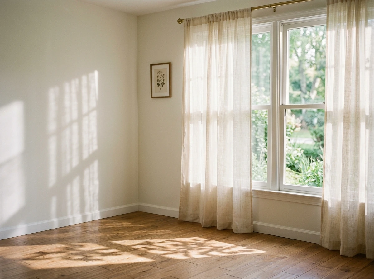
Natural light in a classic living room changes character completely across a single day, and the smartest lighting plans work with that movement instead of trying to override it with heavy drapery. South-facing rooms in Pacific Northwest and mid-Atlantic homes alike get consistent, even daylight, while east- or west-facing rooms swing from soft morning light to dramatic late-afternoon contrast. The mistake is choosing opaque curtains that block this movement entirely, flattening the room into the same static mood no matter the hour. Sheer linen panels paired with a heavier drape allow a classic living room to filter harsh light without losing the daily rhythm that makes the space feel alive. Once you know how your light moves, every other lighting decision in the room becomes a response rather than a guess.
Layered Electric Lighting: Why One Overhead Fixture Is Never Enough
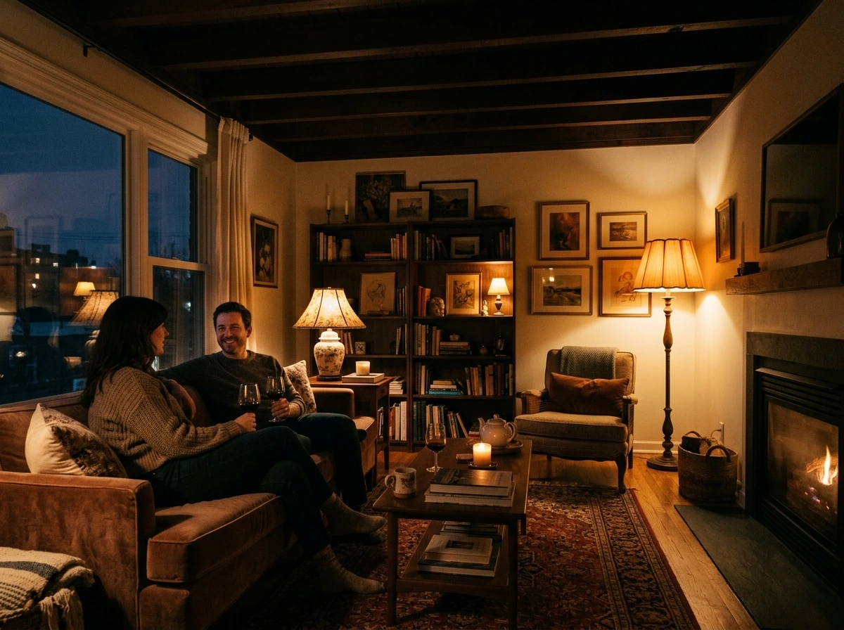
A single ceiling fixture creates flat, uniform light that flattens architectural detail instead of revealing it, which is exactly the opposite of what a well-resolved classic living room needs after dark. The architectural fix is layering three light sources – ambient, task, and accent – each on its own dimmer, so the room can shift mood depending on the hour and the activity. The common failure is installing recessed cans evenly across the ceiling grid without any relationship to the furniture layout below, which lights the floor instead of the people in the room. A dimmable floor lamp near a reading chair does more for a classic living room’s evening atmosphere than any amount of additional overhead wattage. Layered electric lighting is the single most underrated investment in the entire room.
The Classic Table Lamp: Height, Shade, and Placement Rules
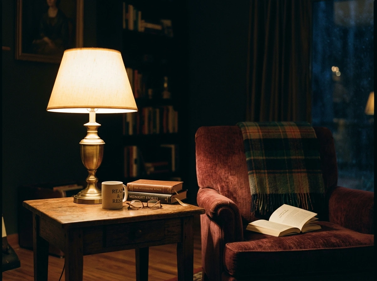
The classic lamp shade style follows a proportion rule most people never learn: the bottom of the shade should sit roughly at eye level for a seated person, which typically puts the base of the lamp between twenty-six and thirty-two inches tall on a standard side table. Get this wrong and the lamp either blinds seated guests or casts light uselessly toward the ceiling instead of the surface where reading and conversation actually happen. A linen shade in a warm white diffuses light more forgivingly than a stark white or dark shade, which matters enormously for how skin tones and upholstery colors read in the evening. Two matching lamps flanking a sofa reinforce the symmetrical furniture arrangement already established by the room’s architecture. This is a small object doing a surprisingly large amount of structural work.
Sconce Lighting as Architectural Detail on a Classic Living Room Wall
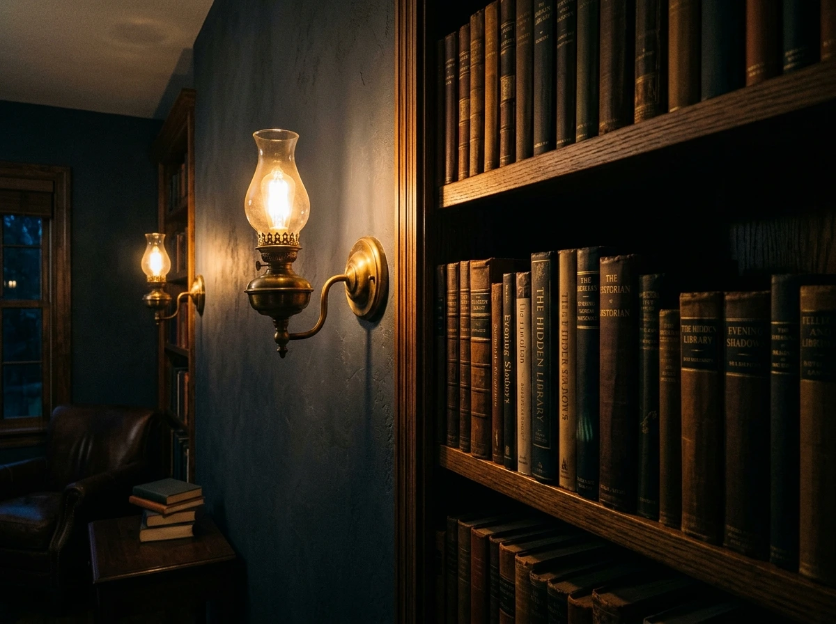
A wall sconce does something no lamp can – it puts light directly into the architecture of the wall itself, which is why sconces flanking a mantel or bookcase read as more permanent and considered than any freestanding fixture. Antique brass hardware home finishes on sconces tend to age gracefully alongside brass door hardware and curtain rods elsewhere in the room, creating a coherent metal palette. The mistake is mounting sconces at a height disconnected from the art or millwork around them, which makes the fixture look like an isolated addition rather than part of the wall’s design. In a classic living room, sconce height typically aligns with the top third of a flanking bookcase or just above mantel height. Used correctly, sconces make the wall itself feel like a finished architectural composition.
The Fireplace as the Room’s Primary Evening Light Source
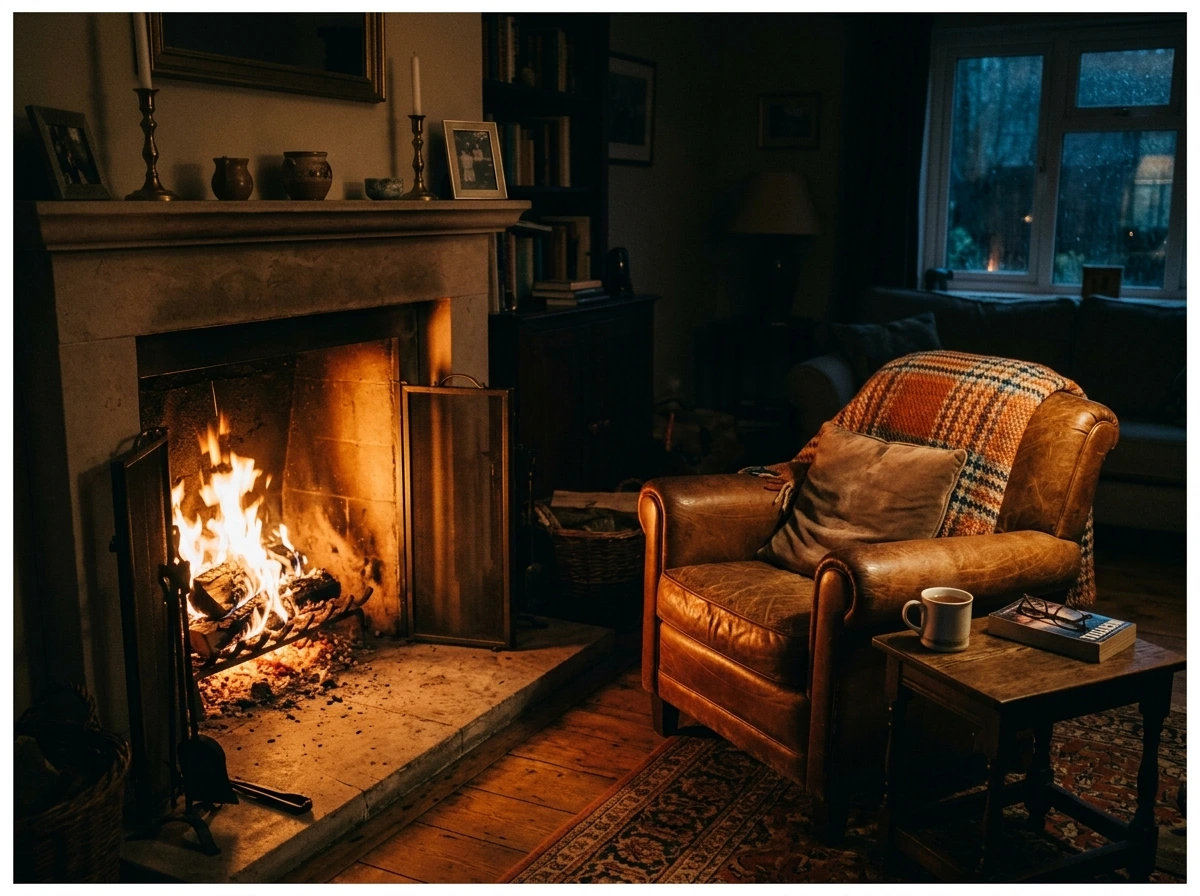
A working fireplace does something electric light never fully replicates – it introduces movement, warmth, and a natural focal glow that pulls the entire room’s evening atmosphere toward it. Positioning the primary seating group to catch this light directly, rather than at an angle, reinforces the fireplace as the anchor established back in Layer 01. The failure mode is treating the fireplace purely as a daytime architectural feature and neglecting it once the sun goes down, leaving the room’s most atmospheric light source unused most evenings. Regardless of the season, a fireplace in active use should be considered part of the room’s lighting plan, not separate from it. This is where architecture and light stop being separate layers and start working as one system.
💡 The Classic Living Room Lighting Formula: What Every Well-Lit Room Has in Common
AMBIENT LAYER: The room’s baseline illumination, typically recessed ceiling fixtures or a central pendant on a dimmer. TASK LAYER: Focused light for reading and close work, delivered through table and floor lamps positioned near seating. ACCENT LAYER: Directional light that highlights architecture and art, delivered through sconces and picture lights. THE RATIO: A well-lit classic living room balances these three layers so no single source dominates, with ambient light typically kept lowest and accent light used to draw the eye toward the room’s best architectural features. WHAT MOST ROOMS ARE MISSING: The accent layer is almost always absent, which is why so many otherwise well-furnished rooms still feel flat after dark — a classic living room with confident depth, including the dark interior ideas approach to shadow and contrast, depends on accent lighting to make that depth visible at night.
Furniture is where most classic living rooms either succeed quietly or fail quietly — there’s rarely a dramatic mistake, just a slow accumulation of pieces chosen for style before scale, which leaves the room feeling crowded or oddly empty no matter how well each individual piece was chosen. Proportion is the relationship between sofa scale, ceiling height, and room depth, and it is consistently the most misunderstood variable in traditional living room ideas.
The Classic Sofa: How to Choose Scale Before Choosing Style
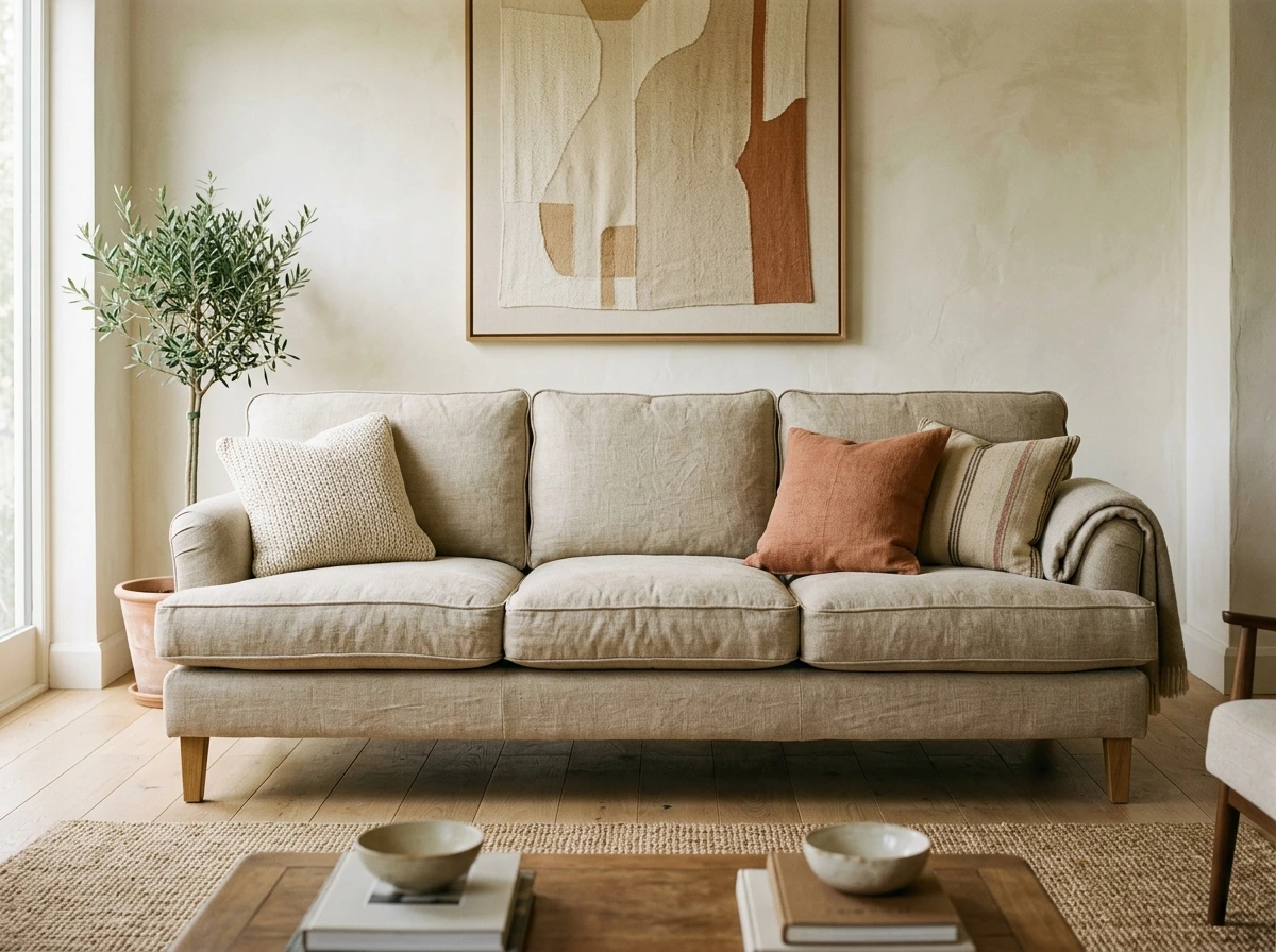
A classic sofa living room decision should start with measurement, not fabric swatches — the sofa needs to leave at least three feet of clearance on all walkway sides and should never span more than roughly two-thirds of the wall it sits against. The specific application in most American living rooms means an eighty-four to ninety-inch sofa for a standard-sized room, sized down for smaller apartments and up for larger great rooms. The common failure is buying a sofa that looked proportionate in a spacious showroom but overwhelms a room with lower ceilings or a narrower footprint. Classic sofa living room upholstery in linen or performance velvet tends to outlast trend-driven prints by decades, which matters for anyone thinking about enduring living room design rather than a five-year refresh. Choose scale first, and the style conversation becomes dramatically easier.
Symmetrical Furniture Arrangement in a Classic Living Room: The Rule and When to Break It
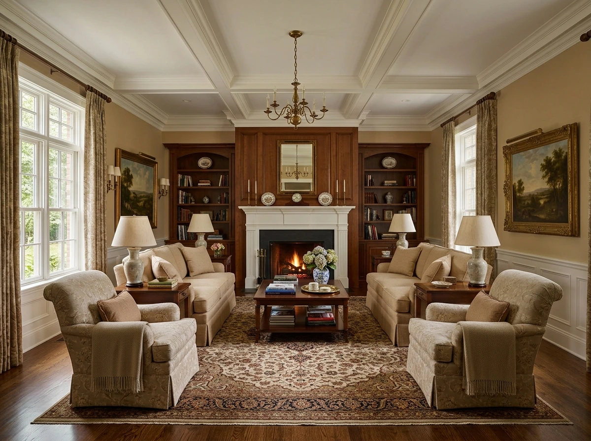
Symmetrical furniture arrangement is the default grammar of a classic interior, built around the axis established by the fireplace or primary window, with matching chairs or lamps balanced on either side. In practice this means a pair of chairs facing the sofa across a coffee table, rather than mismatched single pieces scattered around the room’s perimeter. The mistake is applying strict symmetry so rigidly that the room stops functioning for actual conversation or traffic flow. Breaking symmetry deliberately — one statement chair instead of a pair, for instance — reads as confident rather than careless as long as the rest of the room’s structure remains balanced. Symmetry is a starting discipline, not a rule that can never bend once the room actually needs to be lived in.
The Wingback Chair: Its Specific Role in the Classic Living Room Vocabulary
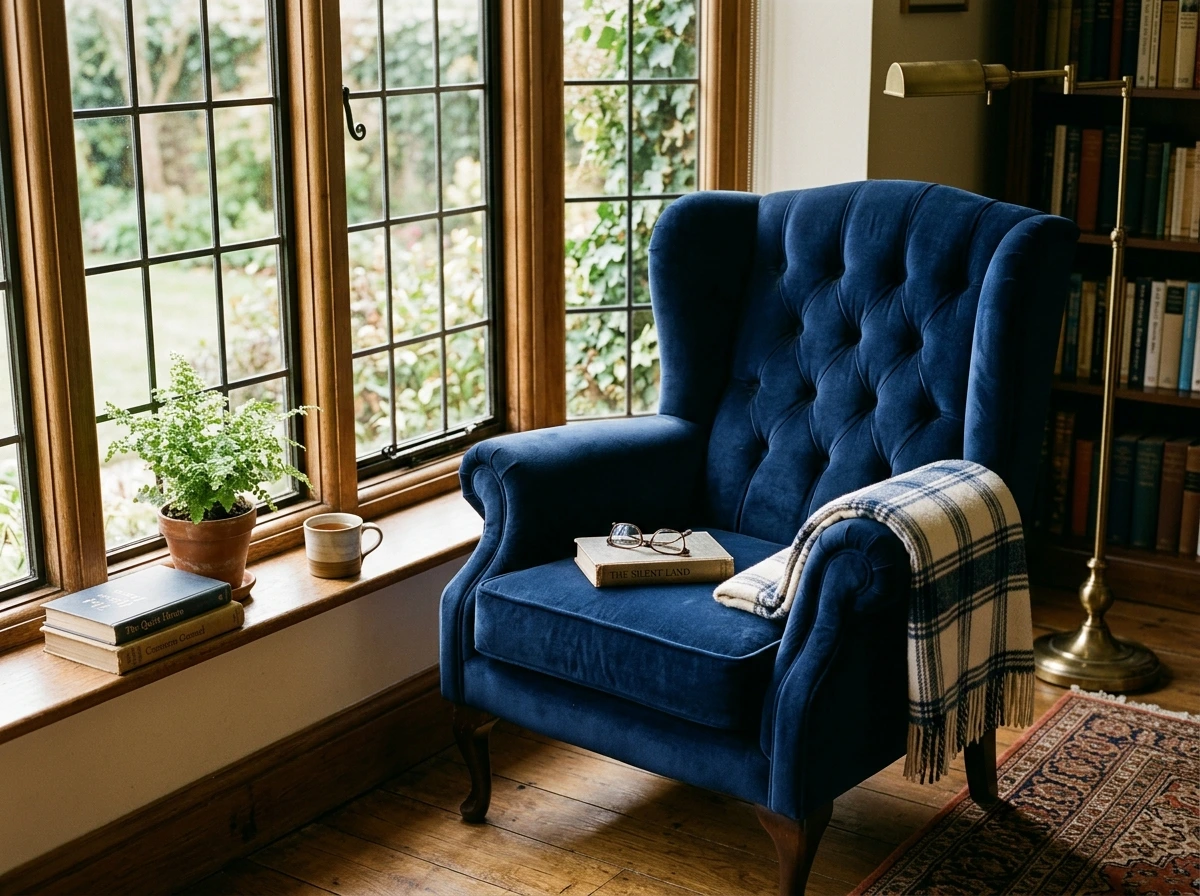
A wingback chair living room addition does something a standard armchair doesn’t – its raised side panels create a sense of enclosure that reads as formal and architectural, which is exactly why it appears so often in New England sitting rooms and colonial revival interiors. Placed at an angle near a fireplace or window, a single wingback chair can anchor a secondary seating zone without competing with the sofa for visual weight. The failure is treating the wingback purely as decoration and placing it somewhere disconnected from actual seating traffic, where it becomes an obstacle instead of a destination. In deep navy velvet or a traditional plaid, this piece carries elegant living room ideas without requiring anything else in the room to change. It’s one of the few furniture pieces that can single-handedly signal a room’s classic vocabulary.
The Coffee Table Relationship: Height, Material, and Proximity Rules
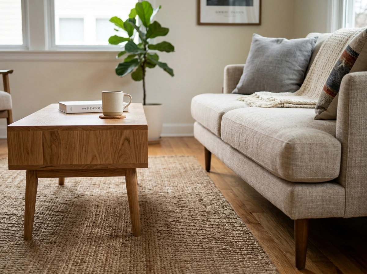
A coffee table exists in direct structural relationship to the sofa in front of it, and that relationship has real numbers attached – roughly fourteen to eighteen inches of clearance between the two, with the tabletop sitting at or slightly below seat height. A dark walnut oval table softens the sharp geometry of a rectangular sofa and reduces the number of hard corners in a room used by families. The mistake is choosing a coffee table purely by visual appeal without measuring the actual walkway space it leaves on either side. Our table styling guide covers the exact vignette principles for what goes on top of the table once its proportions are correct. Get the proximity right first — the styling on top only matters once the underlying relationship works.
Classic Living Room Rug Placement: The One Measurement That Changes Everything
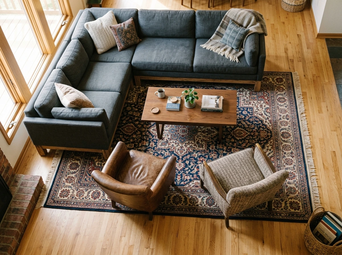
Area rug classic placement follows one non-negotiable rule: the front legs of every major seating piece should rest on the rug, unifying the furniture group instead of letting individual pieces float disconnected across bare floor. In most classic living rooms this means a rug substantially larger than instinct suggests — a nine-by-twelve rug is standard for a full seating arrangement, not the five-by-eight many homeowners default to. The common error is buying a rug sized for the room’s square footage rather than for the furniture grouping it needs to anchor. A wool rug in a subtle geometric or traditional pattern holds up to decades of daily use far better than a synthetic alternative. This single measurement decision does more to make a room feel professionally designed than almost any other single purchase.
The Chesterfield Sofa in a Modern Classic American Home
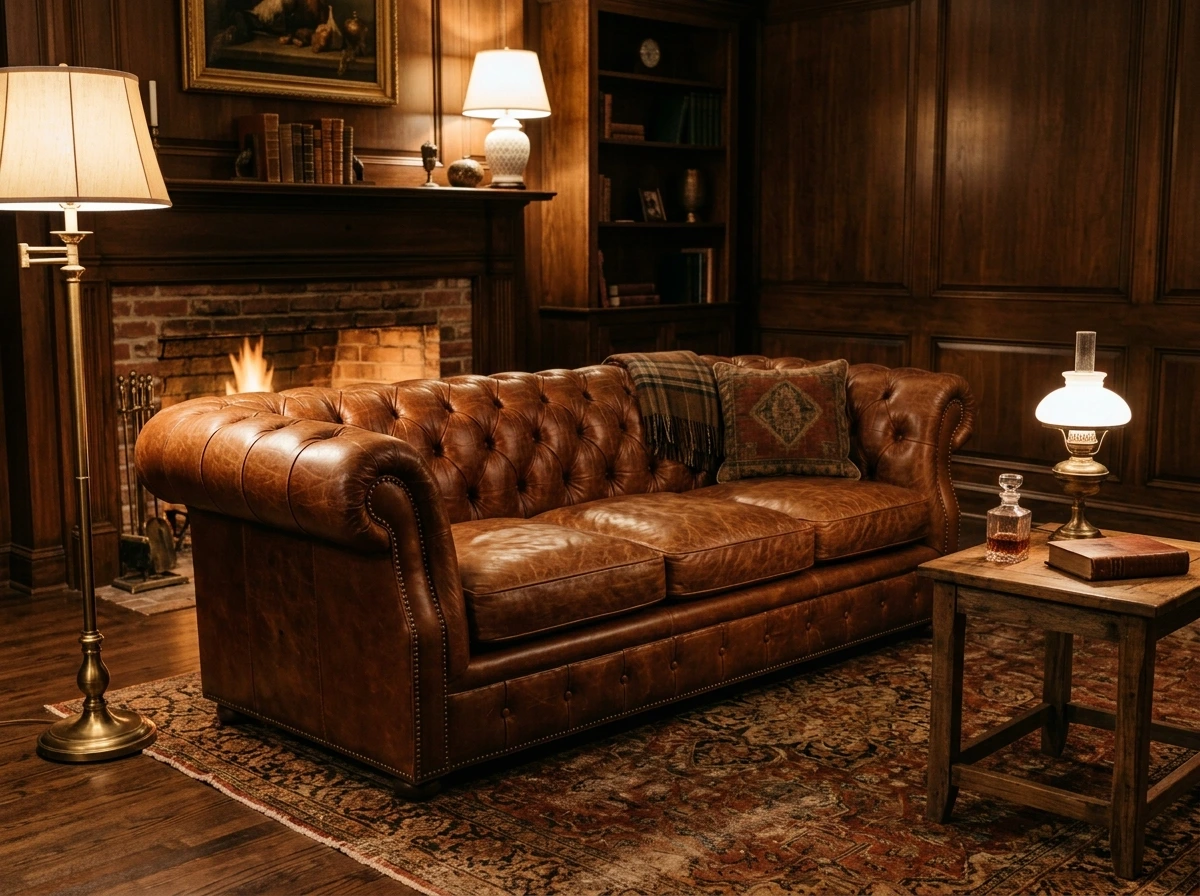
Chesterfield sofa styling brings a specific architectural weight to a room – the rolled arms and deep button-tufting read as substantial and permanent in a way lighter, more casual upholstery never quite achieves. In a modern classic American home, a cognac leather chesterfield can bridge formal East Coast tradition and the more relaxed California casual classic sensibility, depending on what surrounds it. The mistake is pairing a chesterfield with an otherwise minimalist room, where its visual density has nothing to balance against. Paired with lighter linen chairs and a pale rug, the sofa becomes the room’s single confident statement rather than an overwhelming one. This is a piece that rewards restraint everywhere else in the room.
Mixing Furniture Periods in a Classic Living Room: What the Architect Allows and What She Does Not
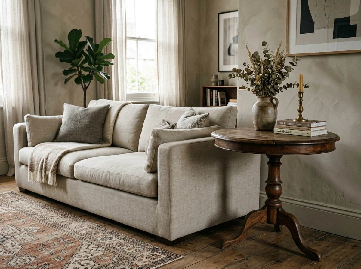
Mixing furniture periods is what keeps a classic living room from reading as a matched showroom set, and the principle that makes it work is consistency of material and tone rather than matching styles. An antique side table can sit comfortably beside a contemporary sofa as long as their wood tones or metal finishes speak the same language. What the architect does not allow is mixing eras without any connective thread at all, which reads as accidental rather than curated. Our vintage design ideas exploration covers how age and character earn their place in a room without undermining its overall cohesion. A classic living room ideas approach to mixing periods is less about rules and more about a single, disciplined eye running through every piece.
The Architect’s Specification: Furniture Scale Rules
- ⬡ Sofa length should not exceed two-thirds of its backing wall
- ⬡ Coffee table height within two inches of sofa seat height
- ⬡ Minimum 30 inches of clearance in every major walkway
- ⬡ Avoid placing more than one visually heavy statement piece per seating zone
📐 The Classic Living Room Proportion Guide: The Measurements That Separate a Designed Room From a Furnished One
SOFA TO COFFEE TABLE: Keep fourteen to eighteen inches of clearance between the sofa’s front edge and the table. COFFEE TABLE HEIGHT: The tabletop should sit at or up to two inches below the sofa’s seat height. RUG SIZE RULE: Every major seating piece should have at least its front legs resting on the rug. LAMP HEIGHT: The bottom of the lampshade should align roughly with the eye level of a seated person. ARTWORK HEIGHT: Center artwork fifty-seven to sixty inches from the floor, measured to the piece’s center point. CURTAIN LENGTH: Drapery should graze the floor or break slightly, never hover above it.
These are the numbers behind every symmetrical furniture arrangement that reads as intentional rather than accidental, and they matter more to a room’s finished feeling than any single piece of classic living room furniture. Our table styling guide applies these same proportion principles specifically to surface styling once the larger measurements are in place.
Once the architecture has done its work and the furniture is scaled correctly, softness arrives through surface and textile — color, drapery, upholstery, and rug material. This is the layer where a classic living room decor scheme either feels warm and inhabited or cold and staged, and the order of decisions matters more here than almost anywhere else in the process.
Classic Living Room Color Palette: The Neutrals That Never Need Replacing
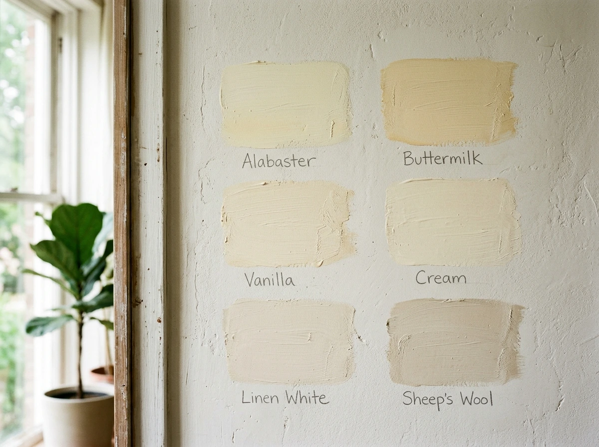
A classic living room color palette is built on neutrals that shift subtly with the light rather than fighting it — warm whites, soft greiges, and deep creams that read differently at nine in the morning than at six in the evening. The specific application means testing paint samples on the actual walls at multiple times of day before committing, since undertones that look neutral in a paint store often reveal pink or green casts once installed. The mistake is choosing a trend-driven color that photographs well but grows tiresome within a year or two of daily living. A sophisticated living room ideas palette leans on layered neutrals with one confident accent color, rather than several competing hues fighting for attention. This is the palette decision that ages best across every design era, not just the current one.
Drapery and Curtain Decisions in a Classic Living Room: Length, Weight, and Hanging Height
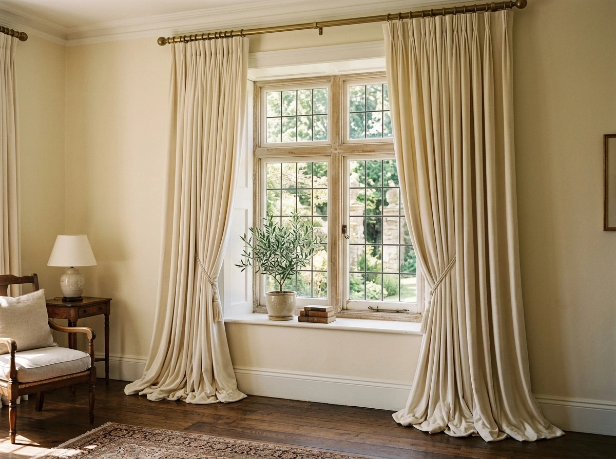
Classic curtain and drape style follows a hanging height rule that most homeowners get wrong by hanging rods directly above the window frame instead of closer to the ceiling. Mounting drapery hardware four to six inches below the ceiling line, rather than the window trim, makes the ceiling read taller and the window read more generous than its actual dimensions. Velvet panels in a rich ivory or muted jewel tone add substantial texture without darkening the room the way a heavier, darker fabric would. The common failure is short curtains that stop above the floor, which instantly reads as unfinished no matter how expensive the fabric. Get the hanging height right and even modest drapery starts to look architecturally deliberate.
Throw Pillows in a Classic Interior: The Number, the Pattern, the Placement
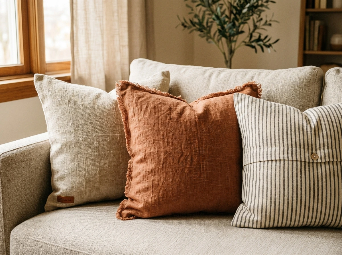
Throw pillow arrangement in a classic interior follows an odd-number rule for a reason — two matching pillows plus one contrasting accent reads as intentional, where four identical pillows starts to feel like a hotel lobby rather than a home. Linen and velvet living room textures paired together add tactile variety without introducing competing patterns that fight each other for attention. The mistake is over-accessorizing a sofa with so many pillows that there’s no actual room left to sit comfortably. A restrained trio in coordinated neutral tones supports the room’s traditional living room decor without adding visual noise. Pillows are the easiest and cheapest way to test a color direction before committing to it elsewhere.
Upholstery Choices for Classic Living Room Furniture That Last Decades
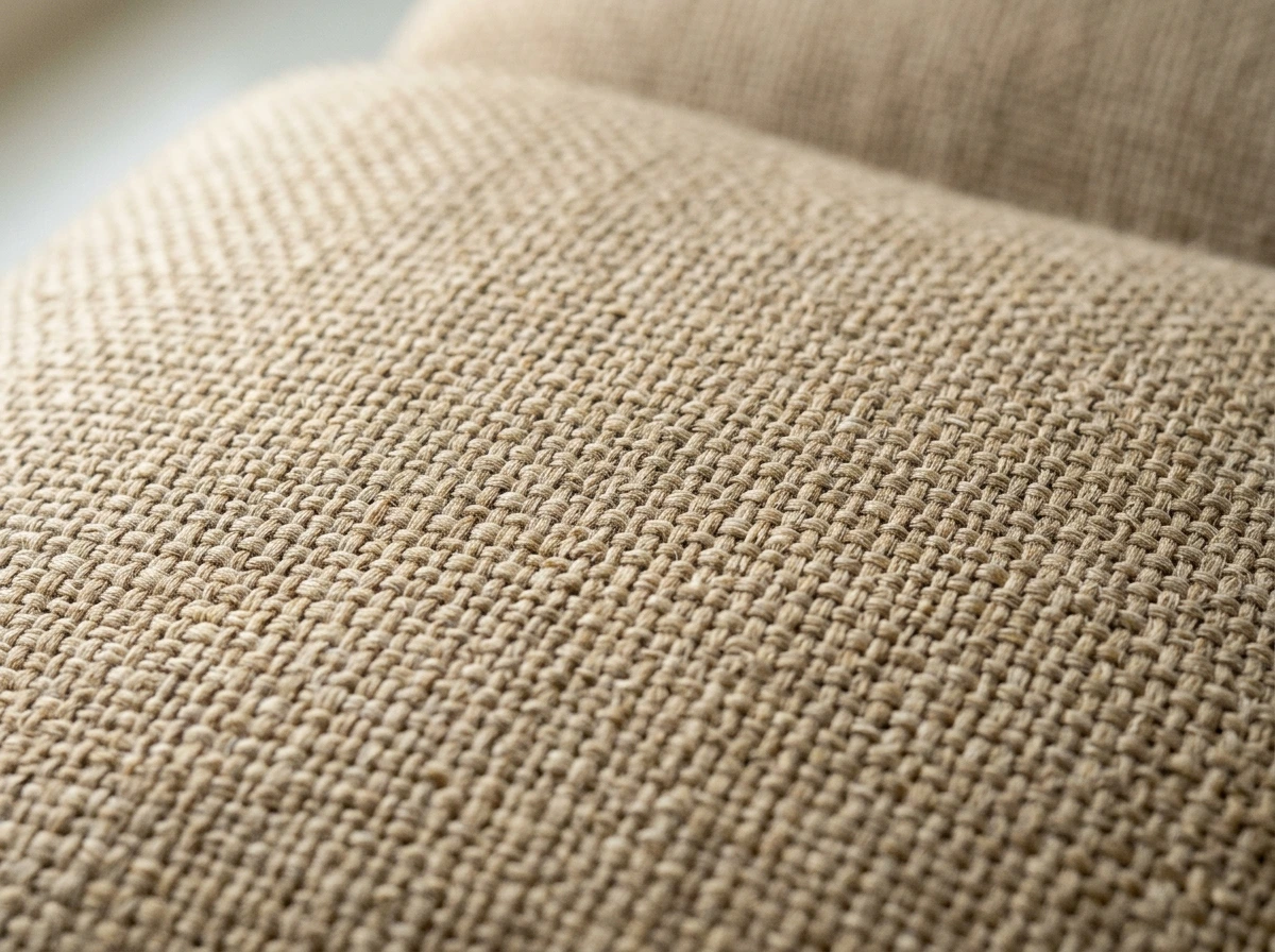
Upholstered sofa classic style depends heavily on fabric performance, not just appearance — a tightly woven linen blend or a performance velvet resists wear and staining far better than a loosely woven decorative fabric that looks similar on a swatch card. Classic living room furniture built to be lived on daily needs fabric rated for real household traffic, not just showroom display. The failure mode is choosing fabric purely for color, then discovering within a year that it pills, fades, or stains in ways a more durable weave would have resisted. A neutral performance fabric also ages more gracefully than a trend color, supporting enduring living room design over a much longer horizon. This is an investment decision disguised as a decorating one.
The Classic Area Rug: Material, Pattern, and the Proportion Rule Most People Ignore
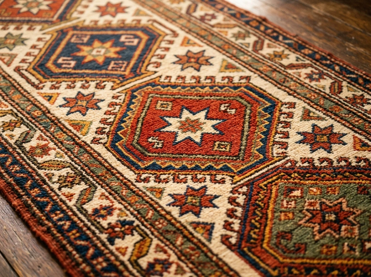
A classic area rug in wool holds color and pattern with more depth than synthetic alternatives, and its natural fibers tend to soften and improve with age rather than flattening out. The specific proportion rule most people ignore is leaving an even border of visible floor around the rug’s perimeter — typically twelve to eighteen inches on all sides — rather than pushing the rug edge to edge or leaving it stranded too small in the center. The mistake is prioritizing pattern over size, ending up with a beautifully patterned rug too small to anchor the actual furniture grouping. A traditional Persian-style or subtle geometric pattern supports classic living room furniture without overwhelming it visually. This is the textile layer’s foundation — get the rug’s scale right and everything placed on top of it looks more considered by default.
🎨 The Classic Living Room Color System: How the Architecture Determines the Palette
THE ARCHITECTURAL BASE (60%): Warm neutral wall and trim tones carry the largest share of the room’s color story, since they interact directly with the crown molding and floor established in Layer 01 — consider warm white, soft alabaster, or a pale greige.
THE FURNITURE LAYER (30%): Mid-depth tones on the major upholstered pieces relate back to the base without disappearing into it — cream linen, camel leather, and muted sage all read as classic living room color palette staples that hold their own without shouting.
THE ACCENT LAYER (10%): The smallest, boldest color commitment lives in pillows, art, and small objects — introduce it through a single piece of statement art, a lamp shade in a deeper tone, or a scattering of ceramic accessories.
This layered ratio is what separates a traditional living room decor scheme that feels resolved from one that feels like a collection of unrelated purchases. For homeowners drawn to a warmer, earthier direction within this same structure, our warm tone styling guide shows how those tones move fluidly between rooms without losing the architectural logic established here.
Detail is the final ten percent of a classic living room project, and it’s also the layer the eye remembers most clearly after leaving the room. Two identically furnished spaces can feel entirely different depending on hardware, accessories, and the finishing choices that get made last — this is where a classic home interior earns its final, most personal layer of character.
Antique Brass Hardware and Fixtures in a Classic Interior
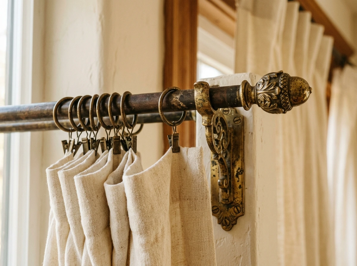
Antique brass hardware home details tie the room’s metal finishes together across curtain rods, lamp bases, picture lights, and door hardware, creating a coherent thread that runs through every layer already established. The specific application means auditing every visible metal surface in the room and unifying finishes rather than mixing chrome, brass, and black hardware without any relationship between them. The mistake is treating hardware as an afterthought purchased separately from everything else, which leaves the room’s small metal details feeling disconnected. Aged or antique brass finishes develop a soft patina over time that reads as more architectural than a bright, uniform polish. This is the detail work that quietly signals a room was considered down to its smallest fixtures.
The Classic Mantel Vignette: The Architect’s Composition Rules
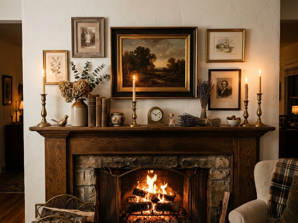
Fireplace mantel styling follows a composition logic borrowed directly from art — an odd number of objects at varying heights, anchored by one larger piece and balanced with smaller supporting elements on either side. The specific application typically means art or a mirror as the visual anchor, flanked by candlesticks or small sculptural objects of varying height. The common failure is centering a single object with nothing supporting it on either side, which reads as sparse rather than intentional. A classic mantel vignette should leave breathing room between objects rather than crowding the surface edge to edge. This is one of the smallest surfaces in the room and one of the most closely observed.
Oil Paintings and Wall Art Placement in a Classic Living Room
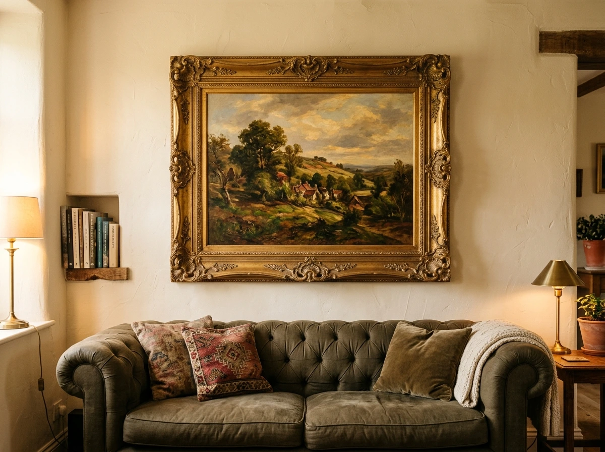
Oil painting living room wall placement depends on a consistent eye-level rule — center the piece fifty-seven to sixty inches from the floor, the same museum standard used across most American gallery installations. The specific application means measuring from the center of the artwork, not its top edge, since frame height varies from piece to piece. The mistake is hanging art too high, a habit left over from taller ceiling heights in older homes that doesn’t translate to standard eight- or nine-foot rooms. A single substantial oil painting over the sofa or mantel carries more architectural weight than several small, disconnected pieces scattered across the same wall. Get the height right and even a modest painting reads as a deliberate architectural anchor.
Books as Architectural Element: The Built-In and the Arranged

Books function as both furniture and finish in a classic living room, filling built-in bookcase living room shelving with genuine texture and color variation that manufactured decor objects rarely achieve. The specific application means mixing vertical and horizontal stacks, interspersed with small objects, rather than lining every spine uniformly along a single shelf. The mistake is over-styling shelves into something that looks more like a retail display than an actual working library. Leather-bound sets add warmth and visual weight when mixed with the homeowner’s actual, well-loved book collection rather than replacing it entirely. This is a detail that rewards restraint and personal history over anything purchased purely for appearance.
The Final Edit: What to Remove From a Classic Living Room to Make It Feel More Resolved
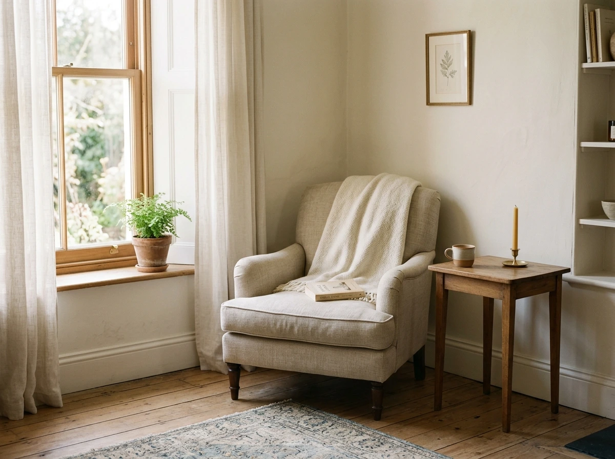
The final edit is the step almost everyone skips, and it’s often the single most impactful decision in the entire project — walking back through the finished room and removing anything that doesn’t earn its place. The specific application means physically taking objects off shelves and surfaces for a week and noticing what you genuinely miss, rather than what simply accumulated over time. The mistake is treating a full room as a finished one, when restraint is almost always what separates elegant living room ideas from merely full ones. A room with slightly less in it almost always photographs and lives better than one styled to capacity. This last step costs nothing and changes everything about how considered the finished space feels.
Classic Living Room Design – Questions Worth Getting Right
What defines a classic living room design?
A classic living room design is defined by architectural proportion, symmetry, and enduring materials rather than by any single trend or decorative object. Classic living room ideas typically center on a strong architectural anchor — a fireplace, a set of proportionate windows — supported by furniture scaled correctly to the room and finished with restrained, quality textiles. This approach to classic interior design living room work prioritizes structure over styling, which is why it holds up decades after installation. The goal is a room that feels resolved rather than assembled from disconnected purchases.
What colors work best in a classic living room?
The most reliable classic living room color palette is built on warm neutrals — soft whites, greige, and cream – layered with mid-depth furniture tones and a single confident accent color. This traditional living room decor approach avoids trend-driven hues that can feel dated within a few years of installation. Deeper tones like navy, forest green, or charcoal also work well as accent or accent-wall choices within this same restrained system. The key is layering, not matching everything to a single dominant color.
How do I make a small living room feel classic and spacious?
Proportion solutions matter more than square footage in a classic living room — a single large rug, floor-to-ceiling drapery, and a restrained furniture count all make a small room read as more generous than it is. Vertical architectural detail living room choices, like taller curtain hanging heights and slim crown molding, draw the eye upward and make ceilings feel higher. Avoid overcrowding a small classic living room with too many small pieces, which fragments the space visually. One or two substantial, well-scaled pieces almost always outperform several smaller ones.
What furniture is essential in a classic living room?
The essential classic living room furniture list is short and deliberate: a well-scaled sofa, a coffee table sized to its proportion rules, at least one pair of matching chairs or lamps, and a rug large enough to anchor the full seating group. Traditional living room ideas add a wingback chair or chesterfield as a secondary seating anchor when space allows. Beyond these core pieces, additional furniture should earn its place rather than simply fill empty floor space. Restraint in the furniture list is itself a classic design principle.
How do I add architectural detail to a plain living room?
Adding architectural detail to a plain room usually starts with crown molding living room installation, since it’s the most cost-effective structural upgrade available and dramatically changes how the ceiling plane reads. Wainscoting, a built-in bookcase, or upgraded window and door trim all contribute to a more classic home interior without requiring a full renovation. These additions should be planned together rather than piecemeal, since mismatched trim profiles can undo the cohesive effect. Even a single well-executed detail can shift a plain room toward a genuinely architectural one.
What is the difference between classic and traditional interior design?
Classic living room ideas generally emphasize timeless proportion and restrained material choices that transcend any single era, while traditional design more specifically references historical American and European decorative styles, patterns, and ornamentation. In practice the two overlap significantly, but a classic room tends to feel calmer and more architecturally driven, while a traditional room leans further into pattern, historical reference, and layered ornamentation. Both approaches value quality materials and enduring construction over trend-driven purchases. Elegant living room ideas often borrow from both categories rather than adhering strictly to one.
How do I mix old and new pieces in a classic living room?
Mixing old and new successfully in classic living room decor depends on finding a consistent material or tone thread that runs through both eras of furniture, rather than matching styles directly. An inherited or vintage piece works best when its wood tone or metal finish echoes something already established elsewhere in the room. Our vintage design ideas resource explores how age and imperfection add character without undermining a room’s overall classic interior design living room cohesion. The goal is curated contrast, not accidental mismatch.
What rug size should I use in a classic living room?
Classic area rug sizing should be determined by the furniture grouping it needs to anchor, not by the raw square footage of the room itself. As a general rule, the front legs of every major seating piece should rest on the rug, which typically means a nine-by-twelve or larger rug for a standard seating arrangement. Undersized rugs are one of the most common mistakes made when selecting classic living room furniture, since a small rug visually shrinks the entire seating group. When in doubt, size up rather than down.
How do I style a classic living room on a budget?
Budget-conscious classic living room ideas prioritize the highest-impact, lowest-cost changes first — paint, lighting layers, and a well-chosen rug typically transform a room more than any single furniture purchase. Secondhand and vintage pieces, refinished rather than replaced, can deliver sophisticated living room ideas without the cost of new custom furniture. Spending selectively on one or two substantial pieces, rather than spreading a budget thin across many small purchases, tends to produce a more cohesive result. Restraint itself is a budget-friendly design strategy.
What makes a living room look expensive without spending a lot of money?
The changes that make a room look expensive without a large budget are almost always structural or textural rather than purely decorative – proper drapery hanging height, a properly sized rug, and layered lighting all read as high-end regardless of what they cost. Classic living room decor that emphasizes restraint over abundance also reads as more considered and, by extension, more expensive. Our seasonal living room guide shows how small seasonal textile swaps can refresh a room’s mood without any structural investment at all, supporting enduring living room design year over year. The most expensive-looking rooms are usually the most disciplined ones, not the most expensive ones.
The Final Blueprint
Classic living room ideas, at the end of every project I’ve worked on, come down to the same conclusion — the best room isn’t the most expensive one, it’s the most considered one. Every layer in this walk-through built on the one before it: structure set the terms, light revealed what the structure was doing, furniture responded to both, textiles softened the frame, and detail signed the room with something personal. Skip a layer, or work out of order, and the room will always feel slightly unresolved even when every individual piece in it is beautiful. Work through the layers in sequence, and a traditional living room decor scheme starts to feel inevitable rather than accumulated.
A classic living room does not exist in isolation – the design language that works here carries through every room in your home, and The Muse Vale has the room-by-room guides to help you carry it there.
Come back to The Muse Vale whenever your space needs a new perspective we will have the architectural thinking and design intelligence ready for every room you are working on.